Great Portraits
http://blog.phowd.com/2014/09/7-tips-shooting-great-portrait-photographs/
The article was about different ways to shoot portraits. The author suggested that we use skills such as negative space and portraits where the subject is not looking directly at the camera.
The article was about different ways to shoot portraits. The author suggested that we use skills such as negative space and portraits where the subject is not looking directly at the camera.
a) There were few photos to choose from, but this was the one i picked because the subject is not focused on the picture, and you can tell that the might like music.
b) In the photo, there is a lot of simplicity. I also see how the guitar isn't exactly the main focus but it helps add t the image.
c) The photographer listed is Rajib Mukherjee.
Killer Timelapse
http://blog.ted.com/2014/10/07/how-to-create-a-killer-timelapse-with-joe-capra/
The website shows an amazing time-lapse video of several places in Rio de Janeiro, Brasil. The time lapses are taken in several different parts of the day. Some places shown are Copacabana beach and the favelas on the outskirts of the city. I learned that time lapses don't have to be long in one section.
a) The video consisted of several time lapses of a city put together in one video. Saw the daytime and nighttime of Rio de Janeiro in several different places at separate times.
b) The photographer is Joe Capra. Joe specializes in time lapse photography and is based in LA.
c) Capra took time to create his new time-lapse with a lot of researching and scheduling. He took about 20-30 minutes to several hours to compete his separate time lapses. He and some of his crew got amazing locations to take photos. It take s about 240-300 photos per time-lapse.
d) I learned that time lapses can be boring if the video is in the same place for too long.
Oldest Living Things In The World
http://www.rachelsussman.com/oltw/
The gallery is photos of old plants and bacteria in different places around the world. Some photos are of old trees and some are mosses. There is even one from under a microscope.
a)I picked this photo because I liked how the colors of the photo contrasted off of each other and the ice makes the photo look cool.
b) I can see balance, and some simplicity.
c) Rachel Susan took the photo.
How to Use a Projector
http://petapixel.com/2015/01/01/projector-brought-forest-turns-nature-glowing-wonderland/
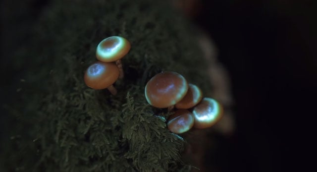
On this website I looked at a video. In the video, light projectors were used to project light shows onto plants and fungus. They were also projected onto certain insects. The video starts off in a dark forest and changes into a light show.
a) The video consisted of several mini videos, and the preparation, of a light show using a projector in a forest. The projectors were focused on different parts of plants and animals with captivating lights that changed colours and patterns.
b) The video was made by photographer Tarek Mawad with the help of animator Friedrich van Schoor. Maw is a visual artist based in Germany. He has specialized in 3d photography and projection mapping.
c) The men used a projector, a computer, and a DSLR on a slider to create the video.
d) I learned that you can use a thing like a projector to create something completely captivating and out of the ordinary.
Spiral Staircases
On this website I looked at pictures taken by Christian Richter, a photographer based in Germany and Europe. This website shows pictures of spiral stair cases.
I learned that there are a lot of old buildings with stairs all around Europe.
A- I picked this photo because I like the way that the stairs look like they go on forever.
B- There is symmetry, balance, repetition and leading lines in this photo.
C- The photographer who took this is Christian Richter.


